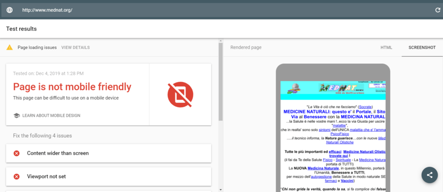
Problems associated with it
- Text and graphics appear too small or too large, making content difficult to read or navigate.
- Navigation menus or other interactive elements difficult to use due to their size or placement on the screen.
- Images or videos not load properly, leading to broken links or missing content.
- The layout of the website is distorted or not fit properly within the screen size of the mobile device.
Use media query to make your website responsive on any size devices
On CSS use the below media query
/* Default styles for all devices */
/* Styles for small screens (up to 576px) */
@media (max-width: 576px) {
/* CSS rules specific to small screens */
}
/* Styles for medium screens (between 577px and 992px) */
@media (min-width: 577px) and (max-width: 992px) {
/* CSS rules specific to medium screens */
}
/* Styles for large screens (greater than 992px) */
@media (min-width: 993px) {
/* CSS rules specific to large screens */
}
Adjust the properties of all the element as per the need, one by one. If you need example about it, please DM me I’ll share some of my sample website’s codes so you can change it’s properties to know how it works.
Hope it helps (: